Prettier Tablature
Spot the difference:
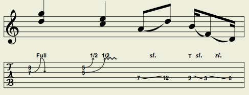
Before
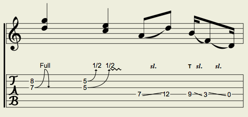
After
Still can't tell? Let me help you out. We have:
- Slightly greater spacing between the tablature stave lines. This makes it more consistent in appearance with printed tablature.
- Stave lines are cleared before fret numbers are rendered, vastly improving readability.
- Font sizes for fret numbers and annotations are bigger.
- Associated notation and tablature staves are connected with a vertical bar on the left.
- Micro-changes in spacing between fret numbers, effects, annotations, etc.
All these changes have been incorporated into TabDiv, and pushed to GitHub. See more on the VexTab Tutorial page. Enjoy!
1 comments (imported from blogger)
The improvements you're making are very helpful, adn I especially like the greater spacing between the stave lines.